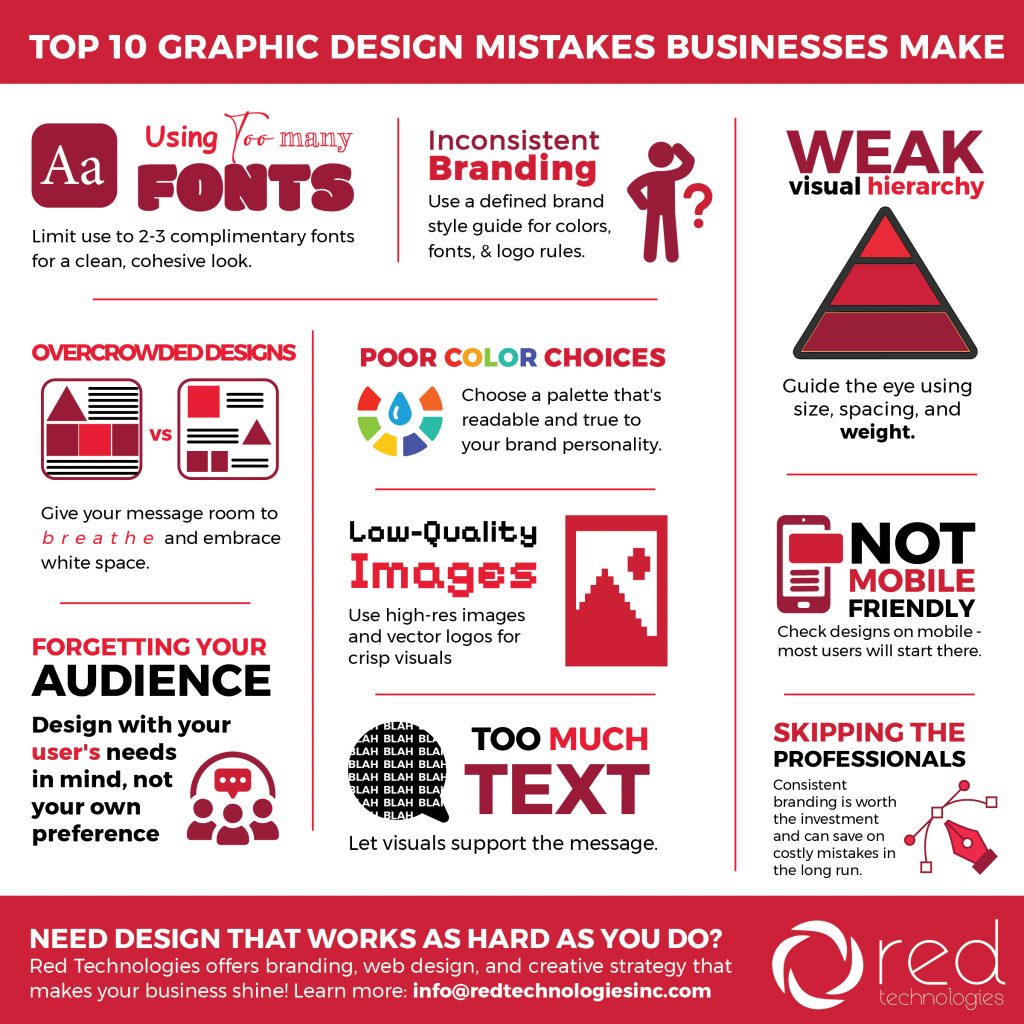
The Top 10 Graphic Design Mistakes Businesses Make (and How to Fix Them)
Inconsistent Branding Across Platforms
Your website uses one blue, your social posts use another blue, your brochure uses a sort-of-blue-ish-blue… and suddenly your brand looks confused.
Why It’s a problem
Hurts credibility
Makes your brand harder to recognize
Downgrades your brand from professional to “DIY” looking
The Fix
Create a brand style guide including:
Official colors (with hex + CMYK codes)
Approved fonts
Logo spacing rules
Examples of correct vs. incorrect usage
Your brand should look like one cohesive family… not distant cousins who barely speak.
Overcrowded Designs
Trying to cram every message, photo, bullet point, and CTA into one design is a sure way to make sure none of it gets seen.
Why It’s a problem
Overwhelms the viewer
Decreases readability
Makes your message unclear
The Fix
Embrace white space
Prioritize one main message
Break complex topics into multiple graphics or pages
Simple designs convert better—always.
Poor Color Choices
 Bright neon text on a patterned background might seem bold… but it’s also a migraine waiting to happen.
Why It’s a problem
Hard to read
Doesn’t match your brand personality
Can unintentionally send the wrong message
The Fix
Choose a cohesive, strategic palette based on:
Your industry
Your tone
Color psychology
Accessibility contrast standards
Pro tip: test your colors on both mobile and desktop, they may look different!
Low-Quality Images
 Nothing brings down a design faster than pixelated images or stretched-out logos.
Why It’s a problem
Looks unprofessional
Makes marketing feel untrustworthy
Undermines product or service value
The Fix
Use:
High-resolution images (300 dpi for print, HD for web)
Vector logos (AI, EPS, or SVG)
Consistent image style (lighting, framing, tone)
Your visuals should reinforce your brand, not distract from it.
Designing Without The Audience In Mind
You’re not designing for yourself, you’re designing for the people you want to reach. Example: Your typical style might be bold and rugged, but that wouldn’t work for a women’s health clinic.
Why It’s a problem
Wrong tone, style, or messaging
Confusing visuals
Missed conversion opportunities
The Fix
Ask yourself:
Who is this for?
What do they need?
What problem are they trying to solve?
What’s the next step you want them to take?
Good design starts with knowing your audience and creating with them in mind.
Bad Hierarchy
 If your headline, subhead, body text, and call-to-action all look the same, users won’t know where to start.
Why It’s a problem
Creates confusion
Makes content harder to skim
Reduces conversions
The Fix
To guide the eye from most important → least important, use:
Font size
Weight
Color
Spacing
Think of hierarchy like a map: your design should show people exactly where to go.
Ignoring Mobile Optimization
A beautiful desktop layout can turn into a cropped, unreadable mess on a phone. Additionally, logos and other images using small or fine details can be lost when shrunk down to fit on a small screen.
Why It’s a problem
70–90% of social media viewing happens on mobile
Tiny text gets ignored
Important info gets cut off
The Fix
Create mobile-friendly versions
Increase font size
Keep graphics vertical or square for social
Test across devices
If your design doesn’t work on mobile, it doesn’t work… period.
Using Too Much Text
Attention spans are short. If your graphic looks like a short novel, your audience is already gone.
Why It’s a problem
People won’t read it
Key messages get lost
Designs look cluttered
The Fix
Be concise
Use bullets, icons, and visuals to simplify
Save longer content for landing pages or blogs
Your design should support your message, not smother it.
Trying To DIY
DIY tools are great, but they can only take you so far, especially when you need your brand to stand out. Sure, your buddy might know how to use Canva, but cookie cutter designs are a dime a dozen.
Why It’s a problem
Inconsistent visuals
Missed opportunities
Difficulty maintaining a professional look
The Fix
Work with a professional design team (oh, hi!) for:
Brand identity development
Website and digital design
Social media graphics
Print materials
Ad creatives
Campaign branding
Good design pays will make you stand out in a sea of competition.
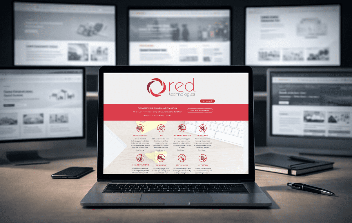
Let’s Make Your Business 🌟Shine🌟
Every day, Red Technologies helps businesses create visuals that are not only gorgeous, but strategic, consistent, and built to convert views to customers. Whether you need a brand refresh, social media graphics, or a full design overhaul, our team is here to help! Want us to turn your ideas into scroll-stopping, brand-boosting visuals? Let us know how we can help!
Click below to let us know how we can help you!